
My journey with GoNxt began in 2022 when I was assigned to lead the redesign of the international version of the highly successful Chinese matchmaking platform, 5E Play, boasting over 100,000 active users. A few months later, new team members from China joined the project.
Due to the language barrier, it became crucial to establish a unified design language. While the new designers continued to work on the designs for the platform, I collaborated with a senior developer and product lead to develop a design system from scratch. This system played a pivotal role in ensuring a consistent user experience for GoNxt.
Due to the language barrier, it became crucial to establish a unified design language. While the new designers continued to work on the designs for the platform, I collaborated with a senior developer and product lead to develop a design system from scratch. This system played a pivotal role in ensuring a consistent user experience for GoNxt.
MY ROLE
Design system lead
DS documentation
DS documentation
TIMELINE
June 2023 - August 2023
TOOLS USED
Figma
Miro
Miro
THE PROBLEM
Why did we need a design system?

Conflicting design approaches and directions

Inconsistency across work done by various designers

Absence of reusable elements, resulting in an inefficient and tedious process

Lack of guidance on the correct usage of specific components
RESEARCH AND INSPIRATION
Learning what’s out there.
Before creating the foundational elements of the design system, I researched existing design systems and numerous educational resources available online. These resources were continually referred to throughout the process and facilitated the necessary learning needed to build a complex and scalable system.

Key learnings:

Setting strong foundations to remove ambiguity and subjective opinion in the design process

Stronger understanding of concepts like design tokens, atomic component design

Importance of documentation and how to structure it for engineering handoff
FOUNDATIONS
Accessibility in every part of the system.
Color Contrast
All brand colors were checked for contrast using the Eight-shapes contrast grid. Adjustments were made as necessary to ensure they comply with WCAG 2.0 minimum contrast guidelines.

Keyboard Control
Every component was designed with a keyboard-focused state to ensure that the final product offers UI interactivity for those restricted to keyboard use.

Content Guidelines
An important consideration throughout the component design process, was to keep real data in mind. This allowed us to cover a variety of edge cases that might arise during actual designing of product.
Content guidelines were also extensively used in component documentation to make it easier for the designers to build an accessible product.
Content guidelines were also extensively used in component documentation to make it easier for the designers to build an accessible product.

Making it all Colorful.
An exhaustive system of tonal palettes was designed to account for all potential types of UI elements while keeping color contrast accessibility in mind at all times.

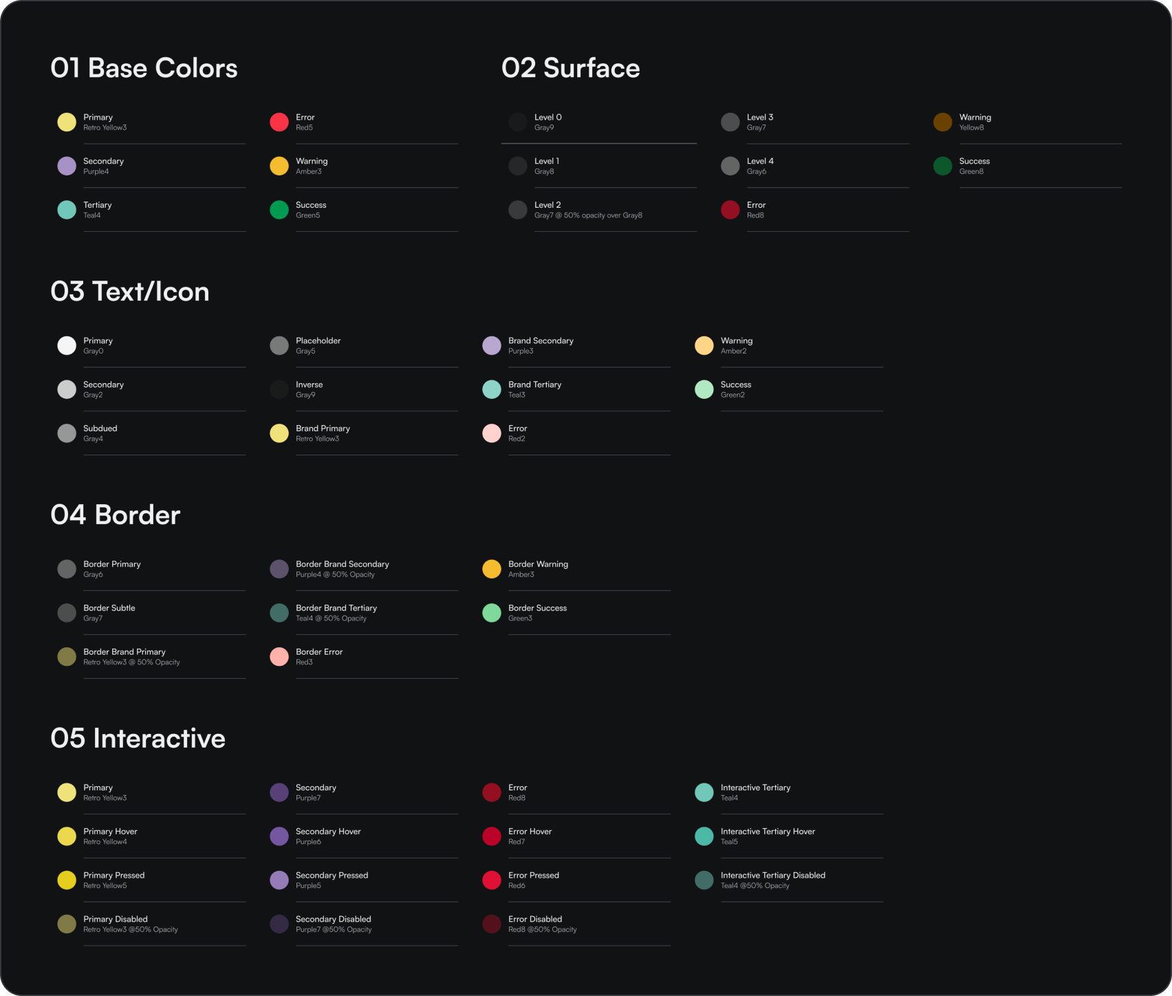
Color Tokens
Defining color palettes wouldn't be meaningful if other designers couldn't use them appropriately during product design.
This is why I defined three levels of color tokens, enabling abstraction of raw color values and define colors based on their use cases.
This is why I defined three levels of color tokens, enabling abstraction of raw color values and define colors based on their use cases.

Bringing in the type.
Blatant — the chosen one
Blatant was chosen as the font family of choice for its clean yet playful aesthetic. This was the only font family used to keep things simple and consistent. Determining the appropriate number of type styles was pivotal to defining a good typography system.
Eventually, I struck the balance of defining enough styles for creating distinct visible hierarchies within interfaces at ease, yet not so many as to overwhelm designers with choices.
Eventually, I struck the balance of defining enough styles for creating distinct visible hierarchies within interfaces at ease, yet not so many as to overwhelm designers with choices.

COMPONENTS
Customization for days.
Using atomic approach, different components were designed through various iterations. Each component offers multiple variants and customizations to account for all the edge cases that might occur during designing products.

Component Variables
The atomic approach also allowed us to build variations within certain components, enhancing efficiency for the designers during the design process.

DOCUMENTATION
Making components useful.
The components would have been of no use if designers and developers couldn't understand how to include them in their workflow and use them effectively. I put a lot of emphasis on documenting components to foster smooth design-engineering collaboration.
General documentation structure:

Anatomy

Variants

Component Variables

Usage Guidelines

CONCLUSION
A bittersweet ending.
By September 2023, due to a change in leadership and financial constraints, GoNxt decided to disband the global design team and revert to working solely with the Chinese workforce, as before. However, during this time, we had successfully built a design system from the ground up and established a common design language that was already being actively utilized by other teams.
Project Takeaways:

Aim for impact, not perfection
The goal was to solve inconsistency across design teams, not build the pixel-perfect library that would sit unused.

Leverage existing frameworks and workflows
Utilizing the near-unlimited resources across the web to save time and focus on tasks that yield tangible results.

Focusing on small and big picture simultaneously
Detailed customizations of components were as important as laying down best design practices across the organization.

Cross-functional partners should be involved from the start
It ensured that the project was heading in the right direction from a technical and content perspective.
OUTCOME
Going out with a bang.
Although we had much bigger plans for Ace design system, the foundations and components already defined left a lasting impact on how the design process was carried out at GoNxt following its implementation.

High adoption rate among team members, implying the usefulness of systems laid out.

Decrease in the average design turnaround time suggesting effectiveness of components and documentation.